
Michelangelo Merisi da Caravaggio, or more commonly known as simply Caravaggio was born in Milan in 1571, his father was Fermo Merisi who worked as a household administrator and an architect. His mother was Lucia Aratori. The whole family fled to Caravaggio when the plague was in Milan in 1584. His dad had died a year after in 1577, and his mom had died in 1584. Some time in 1584 Caravaggio had also gotten an apprenticeship for 4 years by Lombard painter Simone Peterzano. Federico Zuccaro accused Caravaggio for imitating the works of Giorgione and Titian which is reasonable because Caravaggio had been surrounded by these artists.
Caravaggio then later fled to Rome, naked, extremely needy and broke after 'certain quarrels' and wounding of a police officer. A few months later he was doing hack-work for Guiseppe Cesari (Pope Clement VIII's favourite painter), painting flowers and fruit. His known works from this time was "Boy Peeling a Fruit", "Boy with a Basket of Fruit" and "The Young Sick Bacchus". The latter was apparently a self-portrait while he was suffering a serious illness which is suspected to be the reason why he ended his employment with Cesari.
When Caravaggio left Cesari in 1594, he did it with the intention of making his own way now. He struggled but he met and gained some crucial friendships with the painter Prospero Orsi, architect Onorio Longhi and 16 year old artist Mario Minniti. Orsi introduced him to influential collectors, Longhi introduced him to street brawls, and Minniti became an often featured model in Caravaggio's work. For example, "The Fortune Teller" shows Mario and a deceiving gypsy.
His 'homoerotic' themes where a question of debate amongst many scholars and biographers. Robert Hughes (an Australian art critic) described Caravaggio's boys as "overripe, peachy bits of rough trade, with yearning mouths and hair like black ice cream.".
Caravaggio soon started to develop his realism style and show spirituality in his works. He painted everyones flaws, and did not paint an imaginary ideal of them. This allowed for his virtuosic (remarkable skill) talents. He also preferred still lifes and oil paint instead of traditional and length preparations. One of the characteristic paintings by Caravaggio at this time which gives a good demonstration his virtuoso talent was his work, Supper at Emmaus from c.1600-1601.
According to one early biographer, the Flemish writer Karel van Mander, Caravaggio used to work intensively for a fortnight and then “swagger about for a month or two with a sword at his side … from one tennis-court to the next, ever ready to engage in a fight or an argument, with the result that it is most difficult to get along with him”. And, in the early years of the 17th Century, he was brought to trial on at least 11 occasions. The charges included swearing at a constable, penning satirical verses about a rival painter, and chucking a plate of artichokes in a waiter’s face.
And then, in 1606, he was forced to flee Rome, after killing a man during a brawl sparked by a dispute over a game of tennis. He spent the rest of his life on the run, before he collapsed and died, in the summer of 1610, while travelling back to Rome to seek a pardon from the pope.
As for his technique, Caravaggio had dismissed learning about the techniques of drawing. He valued the importance of looking at nature and capturing his models (which were mostly collected from the street) with all their flaws as well. For example, if they had a scratch on their face or dirty nails he would paint it. One time he had said that painting inanimate objects required as much skill as painting figures, which was really revolutionary for that time but it describes perfectly his attitude towards his technique.
His use of light was his second biggest innovation and what biographers talk about the most. He used the light to add drama and capture the form. He would use light from above and wouldn't paint during daylight.
His technique became quite popular, but by the mid 17th century, people had reverted back to their old ways. It was a phase that happened abruptly and ended abruptly.
In 1599, Caravaggio decorated the Contarelli chapel in the church of San Luigi Dei Francesi, which was made up by two famous pieces; the Martyrdom of Saint Matthew and Calling of Saint Matthew. Tenebrism describes the dark, mysterious and dramatic theme seen in Caravaggio's work. Also, his ‘acutely observed realism’ brought a new level of emotional intensity. He was praised for his great skill, and how well of an imitator of nature he was.
Then the next stage in his work were commissions for religious works of; violent struggles, grotesque decapitations, torture and death. Most of them added to his fame but there were still some that had been rejected or requested to be re-painted, etc. His realism was also thought of as unacceptably vulgar. For example, the Conversion of Saint Paul was rejected, and then Caravaggio made another version called the Conversion on the Way to Damascus which was accepted.
Another example of his work being rejected was when he made ‘The Grooms’ Madonna’/‘Madonna Dei palafrenieri’ for a small alter in Saint Peter’s Basilica in Rome, which was only showcased for two days and then taken off when the cardinals secretary wrote “In this painting there are but vulgarity, sacrilege, impiousness and disgust...One would say it is a work made by a painter that can paint well, but of a dark spirit, and who has been for a lot of time far from God, from His adoration, and from any good thought…”. The Death of the Virgin; was rejected because the model was a well-known prostitute as the model for the Virgin, but it was also recorded because of Mary’s bare legs.
A BRIEF HISTORY

Caravaggio
THE BOY WITH THE BASKET OF FRUIT

The Boy with a Basket of Fruit
Caravaggio, 1593
oil on canvas
67 x 70 cm
from https://www.wikiart.org/en/caravaggio/boy-with-a-basket-of-fruit-1593-1
Initial Response
This is called the “Boy with A Basket of Fruit” by Caravaggio in 1593, using oil on canvas. I chose this artwork because it looks so interesting and almost juxtaposed. I am interested to understand the intentions of the painting. It makes me feel emotional and sensual, in the sense that I feel more aware of my emotions and as though I should embrace my emotions. The harsh collarbone and the surprisingly sharp fruit leaves are the focal points of the painting, as they are both in the middle and that they contrast with the rest of the painting which is quiet and soft.
Contextual Understanding
The Artist
Michelangelo Merisi da Caravaggio, or more commonly known as simply Caravaggio was born in Milan, his father was Fermo Merisi who worked as a household administrator and an architect. His mother was Lucia Aratori. In 1584 the family fled to Milan because of the plague. He was Trained in Milan and active in Rome (1592–1606), Naples (1606–7; 1609–10), Malta (1607–8), and Sicily (1608–9). This was one of his early paintings that he made in Rome. The model was his friend and companion Sicilian painter Mario Minniti, at about 16 years old. It was a work made for his Master Giuseppe Cesari and his collections in his workshop, so it was not commissioned for anything special in particular.
Background
Caravaggio had started with painting flowers and fruits for Cesari as part of his apprenticeship. The work was quite in the style of Titian, which is likely because he had an apprenticeship for some time with Simone Peterzano before working for Cesari which did apprenticeship work for Titian. The work may not have been done in order to communicate a certain message, but rather to reveal the artist's ability to depict a high realism.
Associations & Influences
Most of Caravaggio's work including ‘The Boy with the Basket of Fruit’ were portraits or still-life’s in a Baroque style as well as the Renaissance style, which was the art periods during that time. He worked with the Tenebrism and Chiaroscuro style which denotes the style of very dramatic and aggressive contrasts in lighting.
Ideas & Intentions
Masculinity during the Renaissance period was talked about in a bad light, specifically masculinity’s negative effects. Men were scared to be too effeminate. They could be condemned for femininity if they were too polite or too caring. Caravaggio could be trying to communicate some sort of protest or new perspective in this piece. Fruit in mythology is represented as sweet and feminine, but here there is a boy embracing a basket full of it. It is also a symbol of fertility, which makes the fruit sensual and intimate. It is interesting because Caravaggio is known to be asserting his masculinity and his dominance over a lot of people. The fact that a very aggressive man who had been sent to jail for killing a man also paints images of young boys with baskets full of feminine and vibrant fruit is clashing and confusing with our idea of him. The painting reveals a homo-erotic theme that is constant in a lot of paintings during this time as well. We know that from the 1400s in the Renaissance there had been sensual and not religious paintings which were celebrated, so it is very plausible to give the time period that homo relationships were going on behind closed doors.
Formal Elements
Colour
Without the basket of fruit, it's very monochrome. White, brown, off-white and not very vibrant at all. No expression through the color without the basket of fruit. However, the basket of fruit is vibrant and everything that the rest of the painting isn’t. The basket of fruit utilizes different colors like purple, red, yellow and green. This contrasts with the rest of the painting and makes the basket stand out. It also brings to attention the ripeness of the fruit. It looks like the fruit has just gotten ready to eat, and intimates that the boy is also ready to ‘consume’ in a sensual and sexual way. This then obviously relates to his homo-erotic theme and could hint to a more personal relationship with this boy.
Shape
Caravaggio composes a triangular focal point starting from the bottom edge of the painting. Then, there are two wing-like shadows on the side of the boy, which almost looks like the boy is an angel. The triangle takes up most of the space which includes the boy and the basket as the focus of the work.
Contrast
The background in the painting goes from light to dark starting at the top. The general shades of the boy going from top to the bottom is dark to light (his hair and then his cloth). It creates a definite and intense contrast. The edges are very sharp and defined which is quite bitter.
Emphasis
There is an emphasis on the basket of fruit, which has been created with a contrast in colour. The slight tilt of the boy's eyes makes the viewers eyes travel from the eyes down to the basket of fruit and spiralling into it.
Harmony with the monotone and vibrant colour
There is harmony between the two types of colour blends. The monotone and saturated background colours create harmony with the vibrant and interesting colours of the fruit. It creates a harmonious composition. Although the basket is obviously standing out, the fact that these two colour sets complement each other make the independence of each aspect less different and important.
HOW WAS CARAVAGGIO'S PAINTINGS MADE?
EXPERIMENTATION with drawing using measurements
Caravaggio had developed some revolutionary photographic techniques before the camera was invented. Apparently, he had used a small hole in a roof to illuminate an otherwise dark room, and the image of the scene was then projected onto a canvas by a lens and mirror. He had then used a mixture of light-sensitive chemicals which included the powder from crushed fireflies (which he knew about because it was used as special effects during theatre productions). What is interesting to note is that one of the crucial chemicals was mercury, which is known to - at extensive exposure times - create an irritable mood which could explain why Caravaggio was always looking for a brawl. We know that Leonardo Da Vinci had first described the 'camera-obscura', Caravaggio was probably the first one to use it.
There is a lot of proof of this technique, the main idea is that he did not use preliminary sketches (which can be seen through scans), he had just gone straight ahead into the painting (which wasn't usual during those times for art). An abnormal number of his subjects were also seemed to be left handed, which could be explained by the fact that the images are projected onto the canvas backwards. However that idea fades away in his later works, which could be a sign that he learned a lot of good technique and was able to further enhance his own talent.

Euan Uglow


We took some time to make sketches of our hands and our faces by using tools to make measurements, which was essentially simulating how Euan Uglow and Caravaggio did to make their paintings, on a much smaller and less intense scale. It felt a lot like cheating. Before trying this new method I had no other tools or measurements going in between me looking at the object and drawing it onto the paper, but after finding how effective and efficient it is compared to the previous method, made me feel more convinced and understanding that artists do this all the time especially Uglow and Caravaggio made me feel more at ease about 'cheating' by using this method.
I experimented with measurements and;
-
Drawing a hand
-
Drawing the face with a mirror
-
Drawing a skull
-
Drawing a portrait from a photo graph
Experimenting with drawing a hand
1. I shaved a graphite stick on an A4 piece of paper and rubbed to create a darker tone on the paper so that when I needed to add in the shading I could either erase to create a very intense highlight or add even more shading to create a darker shadow.
2. Then I made crosshairs on a clear A4 plastic sheet and put it on top of my hand. I positioned my hand in place and drew the outline of my hand onto the plastic sheet of paper.
2. I took the plastic sheet and put it on a blank paper and drew the outlines underneath with a pencil. Then, I put my hand back into position, refined the outline, and added shading.
Reflection
This technique had felt a lot more like cheating than when I had drawn a portrait. There is very little skill required to do such a drawing, until the last step. But, you can achieve a lot of detail and a high precision with only the previous 4 steps. Although, the final piece looks very realistic and it achieves a high accuracy that is hard for me to do otherwise. I had utilized my pencil to bring the points from the plastic to the paper, which Euan Uglow had done as well. He would use his pencil to measure distances between points.
Experimenting with drawing the face with a mirror
1. Using a similar method, make crosshairs on a mirror, keep your head still, and draw an outline of your face directly on the mirror.
2. Using the crosshairs as reference points, transfer the outline on the piece of paper.
3. Add in shading and tones.
Reflection
I had never used a mirror before to create a self-portrait of myself. I had previously worked uniquely from photographs. As you can see in the picture on the right, I had outlined over my reflection in the mirror. From then, with one eye closed the whole time, I had transferred the work onto a piece of paper with two axes to help with plotting the points on my paper. The mirror and the paper were to-scale. First drawing the lines on the mirror had made me feel like I had been cheating at drawing a self-portrait. I value skill and not necessarily skill. It is hard for me to value a drawing that had utilized so much technique there was not much skill left anymore. I found that this technique had not allowed me to be precise because my head would move and thus the lines on the mirror would not be appropriate anymore. Euan Uglow had also traced the position of his models so that when a painting had taken longer than a day, the models could be in the same position as they had when the painting started. Although, Euan does not normally pay much attention to anatomical details like hair or eyes, which in this close up I had to. Thus, this technique is not appropriate for close-ups.
THE VALUE OF ARTWORK?
It's obvious that adding these shortcuts would create a swifter and quicker process and create something more accurate, which lead me to ask the question; does it matter how much effort and time is put into doing the artwork? Does it matter that it looks as realistic as possible? If so, then what's the difference in aesthetics about a very realistic painting and a photograph? Do we need paintings?
I had the opinion that the more time you put into a piece of work the more value it had. I would value a detailed Renaissance painting many more times over a modern abstract artwork. I still do, but I am more favorable to shortcuts. I don't value how much time spent on something as much as I did before. I think it is ridiculous and naive to stick with an inefficient and time-consuming method due to a popular conservative opinion. Times are changing, and artists are getting better at making art because they are using these methods and shortcuts. Time spent generally doesn't matter as much anymore, and it is mostly about impact and meaning.
In contrasting worlds of art, early classical art was more to do about the skill level of an artist. It was favored to spend a month working on a piece in the workshop. Nowadays, in such a fast-paced world, it is not necessary.
Experimenting with drawing a skull
We got a lesson on the anatomy of a brain to help us understand the structure of a head shape and thus aid in creating a more realistic drawing of a skull. It helped with creating a basic understanding of bone structure so that we could explain the bumps and craters on a face better. We went through 8 steps for the basic shape of a skull. First, we drew an egg shape, then we made crosshairs on the egg to find the earhole, then we drew a triangle to create sort of 'sunglasses', then we drew an orbit, the temporal line, the nasal bridge, the mandible and lastly the dental opening. It was interesting to draw things and feel the bones on my own face, for example, the nasal bridge, and the orbits of our eyes. Below is the drawing that I came out within the end.


practice study
first attempt
After learning about the structure of a skull, I worked from a reference photo of a skull, and utilized the knowledge of the skull shapes to help map out the skull in the beginning sketching of the skull.
My first attempt at drawing the skull looks rushed and incomplete. It was not as smooth as I wanted it to be. There is still some cross hatching and it doesn't demonstrate a good knowledge and understanding of shading and proportions. When I did a second attempt, I spent more focused time on the work. I also spent more time getting the proportions perfect in the beginning which allowed me to understand the shading of it much more.
The second attempt looks more realistic, and drawing skulls has been something that I have spent time with in the past. For a unit in grade 9, we had a 'Beauty and Decay theme' and I created the final piece which is what the photograph below is of. I had made this with pencils of varying softness (mostly 6B and 5B), as well as watercolor, whereas in the ones above I had used graphite pencils and charcoal sticks. There is an obvious difference in the apparent texture of the skulls, the ones above are much more smoother and softer, the one below is clearly more grainy. I had very limited knowledge about different materials and how they behave so I didn't think about using charcoal. You can see the page I have for my work in grade 9 here.
Skeletons and skulls represent death, decay and finals/ends. In the 1300s a skull was used on many desks as a sign of mortality. It reminds people to realize that they will die one day, which is a humbling and motivating message to keep in mind. In my composition that I made in grade 9, I had tried to juxtapose something decaying with something lively and living. I did this by an obvious contrast in color schemes; the flower is bright and vibrant, the skull is dull and grey. The impossible idea that a skull is 'smelling' is entertaining and creative.
second attempt
Egg
Temporal line
Orbit
Nasal Bridge
'Sunglasses'
Mandible
Dental opening

Skeletons and Flowers
Janka van der Merwe, 2015
pencil and watercolor on paper
42 x 60 cm
Experimenting with drawing the face with a photograph
1. Get a printed copy of the portrait that you want to draw. Draw the different shapes of the light and dark areas on the face directly onto the printed copy.
2. Now that the face has been simplified into plain organic shapes, it is easier to replicate onto another surface. Draw the line down the middle of the face vertically, and horizontally going through the eyes as if both lines were to wrap around the head. For more reference, you can add in lines that create relationships with other parts of the face, for example, you can use the eyebrows to map out the position of the eye.
3. Finally, add in shading appropriately.
creating a camera obscurer


the setup
Under the impression and belief that Caravaggio had used a camera obscurer to create his paintings due to the limited time it took him and the quality of the seemingly rushed work for those times, I wanted to understand first hand how a camera obscurer would work. I have taken Physics as a science ever since I could and I am personally passionate about imaging and how light works when it refracts through openings and reflects on mirrors, however, this idea of creating images puzzled me a lot. Only until I built the setup, and positioned the mirror and etcetera for myself could I understand how it worked and it all made sense. The light goes through the hole, and the smaller the hole, the sharper the image, which reaches the mirror and is reflected upside down due to the way that light is reflected through the hole from the objects outside.
-
the window covered by black card to focus light through one small hole
-
the small hole
-
the mirror
The two circles are to highlight firstly the image reflected by the mirror and secondly, the actual section of the same area captured by a camera. The image was more clear and sharp than I had expected and it even had color in some areas. In order to get a good image, the mirror had to be moved around and adjusted until you finally get the best image which takes a lot of trial and error, and it is hard to understand if you don't have a good grasp on how light behaves.


Reflection
The idea of outlining the different areas of dark and light was a different approach than what I am used to and proved to be useful. It made the drawing much easier to shade. Comparing it to the previous portrait that I had done, it looks much more realistic. I have more comfort in these techniques and feel less like I am cheating the more I learn about how other artists use these methods as well.


VS.
EXPERIMENTATION with photography in the style of Caravaggio


Caravaggio utilizes contrasting shadows and highlights in his paintings to create drama, and warm colors to create a Romantic/Renaissance theme to his paintings. In an attempt to do a personal exploration of these ideas, I took these photos of a model wrapped in white cloth, holding a small bouquet. The bouquet and the wrapped cloth create a suggestive meaning, although many paintings by Caravaggio included boys in similar clothing and poses as these photographs.
Firstly, I had used nothing in the background at all, nothing in the background was intentional. This relates to photo 1. After that, I had realized that it did not look as I wanted it to look, and it was much more difficult to remove the background in photoshop, which was where I had edited and color corrected the photos.
After this small problem, I took black cardboard and covered the background of the model to take the photos again. This was a success as the model's light skin tone and especially the white cloth contrast with the background was more similar to Caravaggio's style. However, although there was a background, the endings of the cardboard can still be seen (in pictures 2,3 and 4) which is not what I want. I want a clean, solid background with no flaws. Thus, I started to experiment with lighting. I tried to use a candle to create a warm subtle light, which can be seen in picture 5, which also included flash from the camera. This seemed to work the best. The contrast was even higher with the flash, and the background looked closer to being solid than it had previously.
Once I had gotten enough photos, I moved on to photoshop where I could manipulate the contrasts, darkness, colors, and tones of the photographs to fit the Caravaggio style the best.
Below are 2 pictures of the process of editing the photos in photoshop, as well as a gallery of all the photos that I had edited.


In all the pictures the contrasts are the same, however, the difference is the tones. In the first two, the colors are very cold, the skin tone is more olive colored and the cloth is a very light blue. This is not in the style of Caravaggio's paintings were;
 ‘David with the Head of Goliath’ |  ‘Bacchus’ |
|---|---|
 ‘Doubting Thomas’ |  ‘The Taking of Christ’ |
 ‘The Calling of Saint Matthew’ |
Caravaggio
Photos 1 & 2
Photos 3, 4 & 5
1 2
3
4
5
6
When you select the colors and compare them without the context of the painting, it is much easier to tell the differences in colors. It is obvious that photographs 1 & 2 use much colder colors than photograph 3,4 & 5. The latter photos seem to fashion more purple colors, which could be explained by the fact that the photos were blue to begin with, and after editing red into the photograph, the colors turned purple.
DRAFT PAINTING VERSION of one of the photographs


Step 1: Practicing to paint the photograph on a small scale. This was solely for the purpose of figuring out my own strengths in painting.
Step 2: Create a larger draft version. I had spent a lot of time on this piece, only because I struggled with blending the colors well. Acrylic is very hard to blend, as it dries up very fast, so it is hard to move around color for a very long time. Another aspect that I struggled with was the paints in my palette drying up. For every color in the painting I had to mix different colors, and often I would forget the ratios of the different colors. The dried paint also has a slightly different color than the wet paint, which makes it confusing when you work with layering colors.
Strengths: There are two successful things in this image; the proportions as well as the placement of highlight and shadows.
Weakness: There is little attempt at blending the paint, thus the next step would be to practice blending with acrylic paint or investigate other mediums that would be better at blending.
Step 1
Step 2
the issue; being able to blend colors.
next steps; practice blending acrylic paint, explore other mediums.
PRACTICE BLENDING ACRYLIC PAINT
I practiced blending a sphere as well as a quick copy of the face of the model, done by Mr. Keys. He showed me techniques that I could use to blend paint better; fanning out the brushes, using light and gentle strokes.


PRACTICE USING OIL PAINT
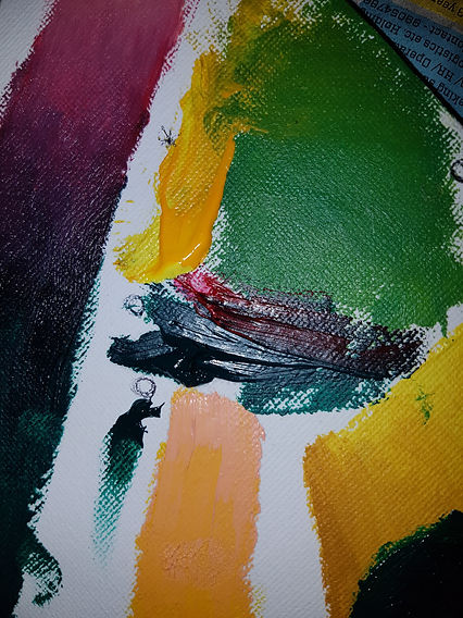
I explored using oil paints as another medium for my painting. Caravaggio used oil paints, along with most painters who paint realistically. I used different colors to create impasto, as well as applying knowledge that I learned from lending acrylic paint to blend oil paint, and using baby oil/turpentine to clean the brushes in between. I found that after 3 nights of sitting in a room purposefully in the area that receives the most A.C. during the night, the paint had finally dried. The paint that had dried had dried in the same position that I had put it in. I had also used oil paint on top of the acrylic paint because I plan to create an underpainting with acrylic and then oil paint on top of it as the final layer. It worked very well, and the paints did not mix.
If you look at the first picture, the yellow is acrylic paint, and the rest is oil paint on top of it. In the second and third photo, the yellow paint on top of the green paint is oil, which obviously lacked opacity.
Oil paint is notoriously hated by many artists due to the fact that it dries very slowly, however that is exactly what is needed for a realistic painting, where a lot of time is spent on moving paint around.
PROCEDURE of creating the final piece
1
2
3
4
5
6
I have decided to do an underpainting which maps out the dark and light areas in acrylic, and then add details and color with oil paint on top. The steps will look like this;
1. Priming the canvas: prime the canvas with a light grey
2. Tracing the photograph: project photograph onto a canvas (like Caravaggio is suspected to have done), and trace the photograph, making sure to outline the dark and light areas (like what was done in the Jorja Smith portrait).
3. The underpainting: paint a rough underpainting with acrylic which maps out the shadows and highlights of the face
4. Final layer: finish with a layer of oil paint which will include color, tones, and details of the face as well as shadows and highlights. This will create the final layer.


2. Tracing the photograph
I traced the projected photograph onto a canvas, which resembles the technique of a camera obscura. I had assistance with holding the canvas up and then made two copies.
3. The underpainting
4. The final layer
This is the first attempt on one of the canvases.
Problem: The tone looks too blue. In the photograph the colors are warm; the brown is more red than purple. Here the color looks very purple.
Next steps: My teacher had suggested that I use more reds. I had already tried to add red but it did come out pink, so he also suggested that I used mid-yellows like cadmium yellow which will tone down the pink-ness
Observe, transform
1. Priming the canvas
I had previously struggled with the difference in the apparent color when the paint was mixed on the palette and when it was on the canvas. After watching youtube advice videos, I realized that a lot of people who painted realistically primed the canvas with something a darker shade than white, because when the color is on a bright white canvas it looks darker than it actually is. This is something I can testify to, so I instead decided that I would first prime the painting before starting to work